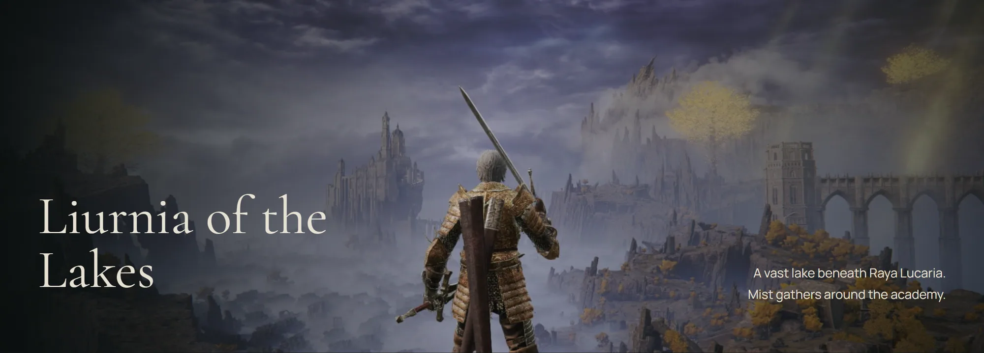
Elden Memoir

How an unfinished Elden Ring wiki became a record of one journey.

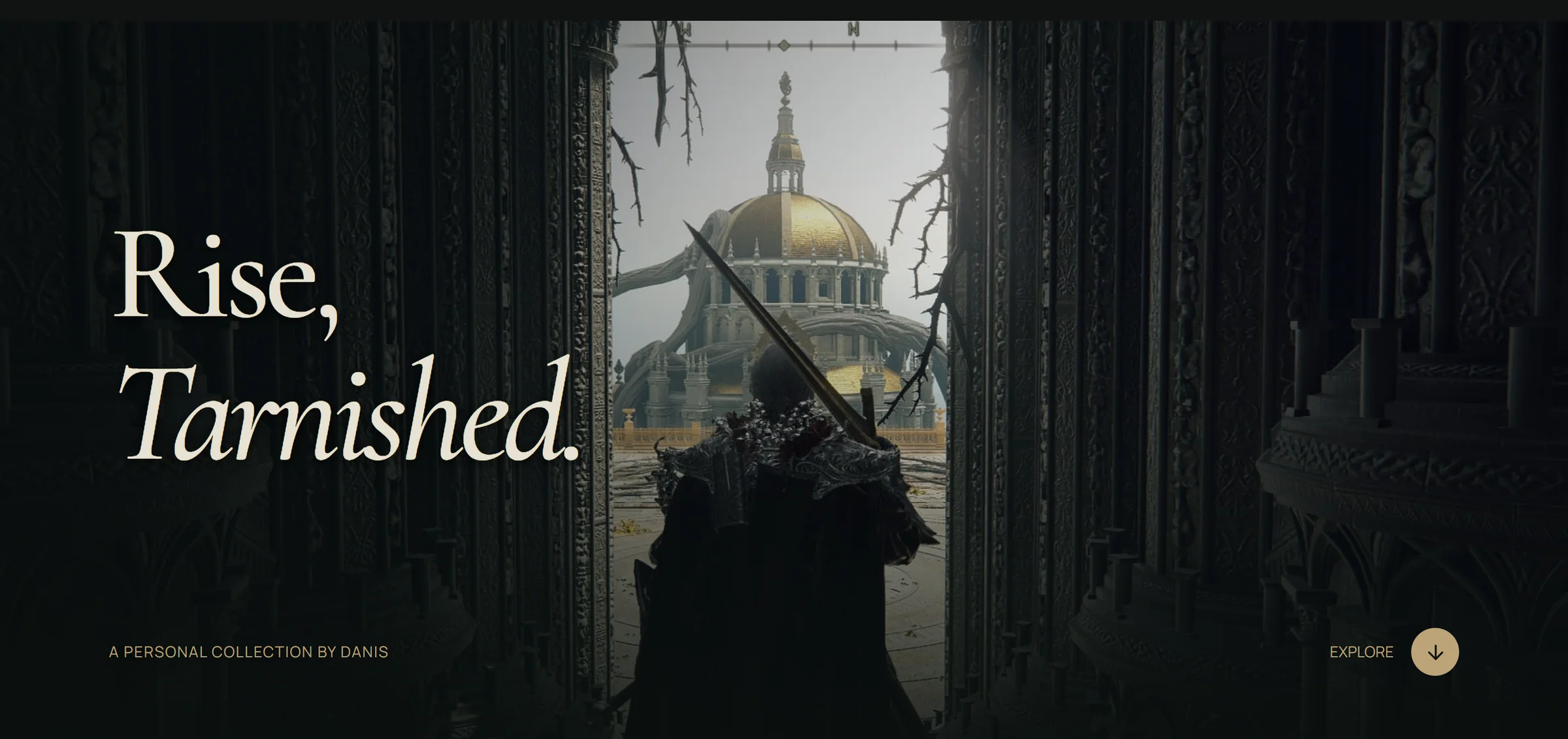
The Elden Memoir homepage: the Tarnished in a dark doorway beneath the title Rise, Tarnished.
Role
Concept, content, UI/UX and art direction. Frontend built with AI assistance.
Tools
Pen.dev, Next.js, TypeScript, Tailwind CSS, Motion
Team
Solo, working with Codex and ImageGen
Timeline
October to November 2026

Problem

The Tarnished Codex felt like an unfinished wiki: plenty of information, no point of view.

Shift

I stopped adding categories and told my own experience through my screenshots.

Result

A seven-chapter landing page and a 78-photo Journal, live and tested with 6+ people.

01 / Context

It started as a folder of screenshots.

When I play Elden Ring I take screenshots without photo mode, because I want my Tarnished to stay in the frame. They record where I went and what I wanted to remember.

They were first planned for the About or Playground page of this portfolio. Then the project became a chance to explore visual and interaction quality, with award-level craft as the bar.

I also worried that a photo album alone would be boring. So I added World, Bosses, Armory, Armour, Essentials and Endings, until it became The Tarnished Codex.

What the Codex held

  • 33places in a searchable atlas, plus 10 featured destinations
  • 17bosses with filters, stories and victory tracking
  • 10weapons and armour sets
  • 6essential items
  • 6endings, in a selector
  • 16of my own photographs

02 / The problem

Plenty of information, no point of view.

By 13 October I had reviewed the site as it stood and written down what I found. This is that version, with those findings. My photographs had become one category among many.

Worth keeping: “Rise, Tarnished.”

Short and right for the game. It is still the title of the live page.

One headline formula

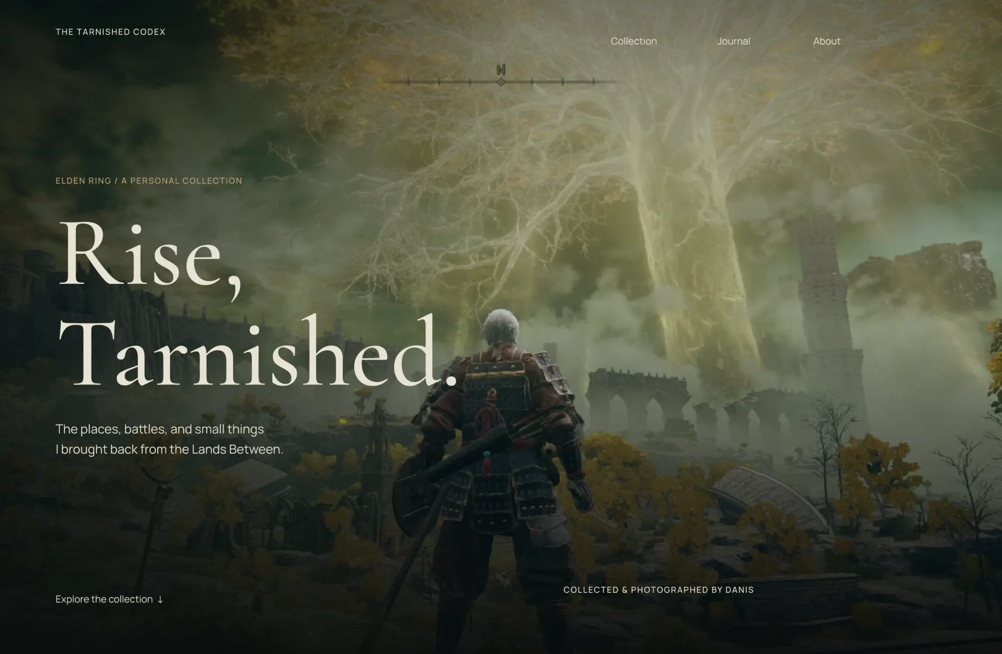
Large serif, last word in italic, section after section. “Follow your curiosity” could sit on any site without a single change.

One section skeleton

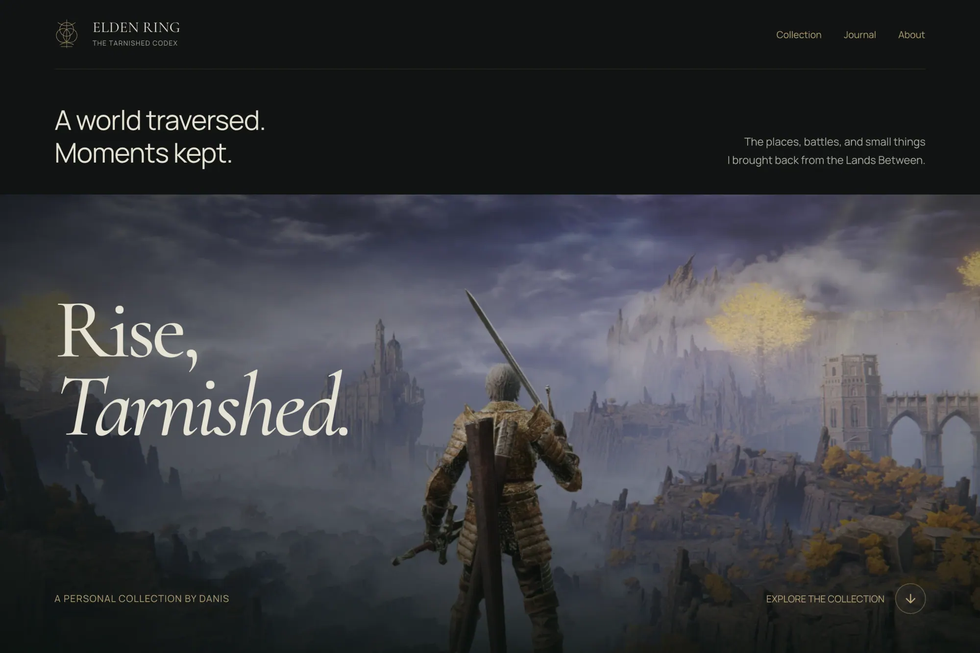
Almost every section runs opener, toolbar, gallery, footer. The page had length but no rhythm.

Worth keeping: the boss gallery

Its varied image sizes made it the most visually alive part of the page.

Too clean for this world

Cream and olive surfaces made Armory and Essentials read like a product catalogue. Dark fantasy, travel editorial and shop were all competing.

Categories for completeness

Six endings were there to complete the set. I had chosen one, and that is the one the site tells now.

The best idea was buried

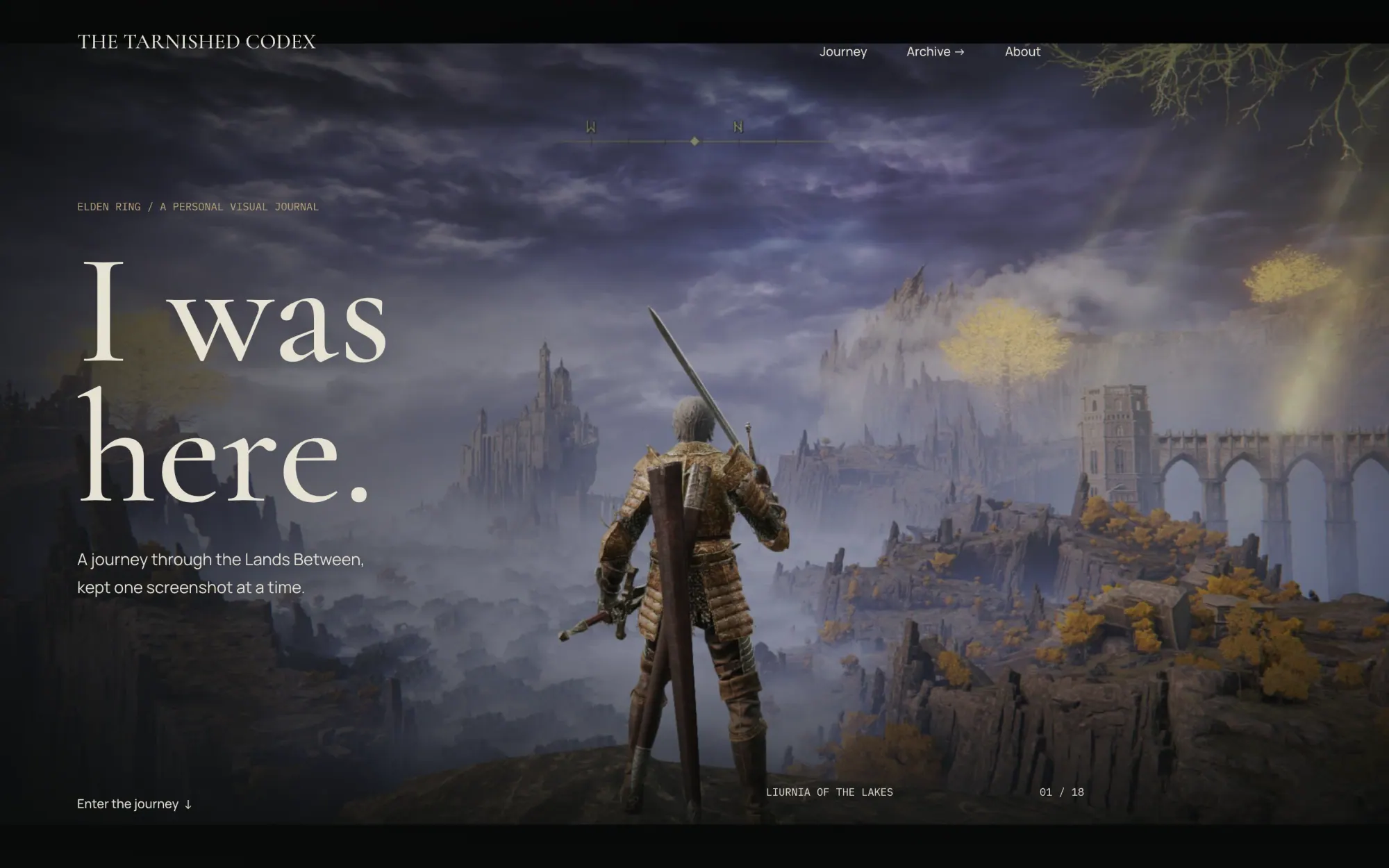
“I was here.” was the strongest personal idea on the page, and it sat below eight other sections.

03 / The reframe

How do I tell my experience through photographs and personal choices, while still giving visitors enough context about the world?

That question replaced “what else should the site include?” It came with a test for every section: does this tell my experience, or does it just add another category?

Only the photographs grew.

What the test did to the content, in items per category.

Number of items per content category in The Tarnished Codex compared with Elden Memoir.
CategoryThe Tarnished Codex, then Elden Memoir
Places
33
4
Bosses
17
2
Weapons and armourone loadout
10
5
Endings
6
1
Essential items
6
6
Photographs
16
78

Curation came before layout.

Every screenshot I had for this project, in the order I took them. The 78 in the Journal are in colour.

Eleven of those I captured during the project, including the frames of the ending itself.

A clear line between what I maintain and what I hand off.

Stays in the project

  • My photographs and captions
  • The encounters I picked
  • The setup I actually used
  • Six items I relied on
  • The ending I chose

Handed to external guides

  • Walkthroughs and quest steps
  • Full boss and reward lists
  • Build calculators and scaling
  • Farming and acquisition routes
  • Every ending and its conditions

One rule for copy: invent nothing.

No play time, no death counts, no made-up memories. If I hadn’t confirmed a detail, it stayed out of the site.

04 / Directions

Three directions, one set of criteria.

I kept the old site and every new direction side by side on the Pen.dev canvas. Before exploring, I wrote down what a good answer had to do.

  • Distinctiveness
  • Photography
  • Atmosphere
  • Hierarchy
  • Rhythm
  • Legibility
  • Honesty
  • Flexibility
  • Feasibility
Version 03 direction: the landing page layout carried over with personal colour and content.
Idea
Keep the layout I liked. Change what it says, and why.
What it did well
I still liked the form of the landing page. What had to change was the content and the reason behind each section.
What it cost
It stays closest to the original, so without the section test it could slide back into a catalogue.
Decision
Chosen as the base, with colour and copy from Hybrid. The focus moved to the journey and the screenshots.

Six versions of the same page.

Hover to scroll through a page, click to open it in full.

  1. 01 · First version

    Field Guide

  2. 02 · Revision, 13 Oct

    Collection

  3. 03 · Direction A

    Personal Journey

  4. 04 · Direction B

    Hybrid

  5. 05 · Direction C

    Version 03

  6. 06 · Shipped

    Elden Memoir

05 / Structure

An editorial order, not a quest chronology.

The page moves from the world, to what I fought and how I fought it, to what I carried and photographed. The last two chapters connect the person who was with me to the ending I chose.

  1. 01 / The world

    Who made this, and where it takes place.

    • Rise, Tarnished
    • Chronicle
    • Places
  2. 02 / The journey

    What I fought, what I carried, what I kept.

    • Hall of Legends
    • My Build
    • The Little Things
    • Photographic Journal
  3. 03 / The ending

    Who was with me, and how it ended.

    • Melina
    • Age of the Stars
    • A world remembered

Three depths of information.

The Codex put everything at the same level. Here each detail follows the same path: the reason it was chosen, visual proof, just enough context, then an external source.

On the page

The story

A photograph, a name, a line or two. Enough for a short visit to feel complete.

In the viewer

The proof

The full frame at its original ratio, with zoom and previous/next. Boss cards open their footage in the same viewer.

Out to a guide

The context

Area, boss, equipment and ending guides live on external wikis. Spoiler-heavy detail stays one deliberate click away.

States designed before any code

Place selected
Boss detail
Item detail
Spoiler note

06 / Key decisions

Four decisions that shaped the page.

Most sections went through several layouts on the canvas. These four changed what the page is, and each one gave something up.

Decision 01

Two catalogues became one loadout.

Armory and Armour were two collections of gear from the game. I merged them into My Build: one character and the combination I used.

I explored five layouts. The live page has four cards, with both Knight’s Greatswords sharing one, so the same weapon doesn’t appear twice in the row.

Trade-off: the row no longer maps one to one onto equipment slots.

Five equal slots
Compact collection
Portrait and index
Grouped loadout
Chosen: Four cards

As shipped: “Steel, fire, and a little faith.”
Decision 02

Seventeen bosses, then five, then two.

Hybrid cut the list to five picks. The live page keeps Malenia and Rennala, my two favourites, and gives each one its own looping footage.

Trade-off: Radahn, Maliketh and Godfrey were real picks too, and they no longer appear in this section.

Before: five encounters, static cards.

After: two favourites, each with its own looping footage.

Decision 03

One portrait became a voyage.

On the boards the ending was a single image with a title. In the browser it became six memories: the frame opens as you reach it, then scrolling moves through them, and it all reverses when you scroll back up.

I had no captures of the ending when I built this. So it launched with frames from Ranni’s quest, in a data file made for swapping. Frames I took on 31 October later replaced the last three.

Trade-off: it is a long scroll, so there is a Skip voyage link, a screen-reader transcript and a static gallery for reduced motion.

Portrait: quiet, but static.

Moon stage: bigger, still one image.

The voyage: one memory sliding into the next.

Decision 04

Five ways to say goodbye.

I explored five closings on the canvas: a signature, a monumental wordmark, a farewell with a chapter index, an imprint, and a single line. The live page ends on that line, “A world remembered.”

Trade-off: no chapter links at the end of a long page, only Credits and Back to top.

The final signature
The monumental codex
Until the next grace
The closing imprint
Chosen: A world remembered
As shipped

07 / Visual system

Colour comes from the photographs.

My first colour exploration was too light for Elden Ring. I moved it to charcoal and dark olive, ivory, and a brass gold, and kept the surfaces quiet so the screenshots carry the colour.

Cold blue appears only in Ranni’s chapter, so the accent has a reason inside the story.

  • Viewer black

    #0B0D0C

  • Canvas

    #111312

  • Surface

    #141712

  • Card surface

    #1B211C

  • Rule

    #383D36

  • Muted text

    #AFB0A6

  • Antique gold

    #BCA477

  • Ivory

    #E7E1D3

  • Ending mist

    #A6BDCC

On the canvas colour, ivory measures 14.3:1, muted text 8.5:1 and gold 7.7:1. Gold marks actions and metadata, while large surfaces stay neutral.

Cormorant Garamond gives headings their character and Manrope keeps interface text readable, with a 14px minimum across all text.

Rules for handling a photograph.

Cards
Cover crops with a clear subject and a deliberate focal point.
Viewer
Contain, so the complete original composition is preserved.
Overlay
A soft directional gradient, only where text needs support.
Colour
No uniform blue or black wash. The scene sets the grade.

The full foundations board.

08 / The result

The finished site.

Seven chapters, a Journal, a viewer, and a page each for About and Credits. Restrained ornament keeps the screenshots at the centre.

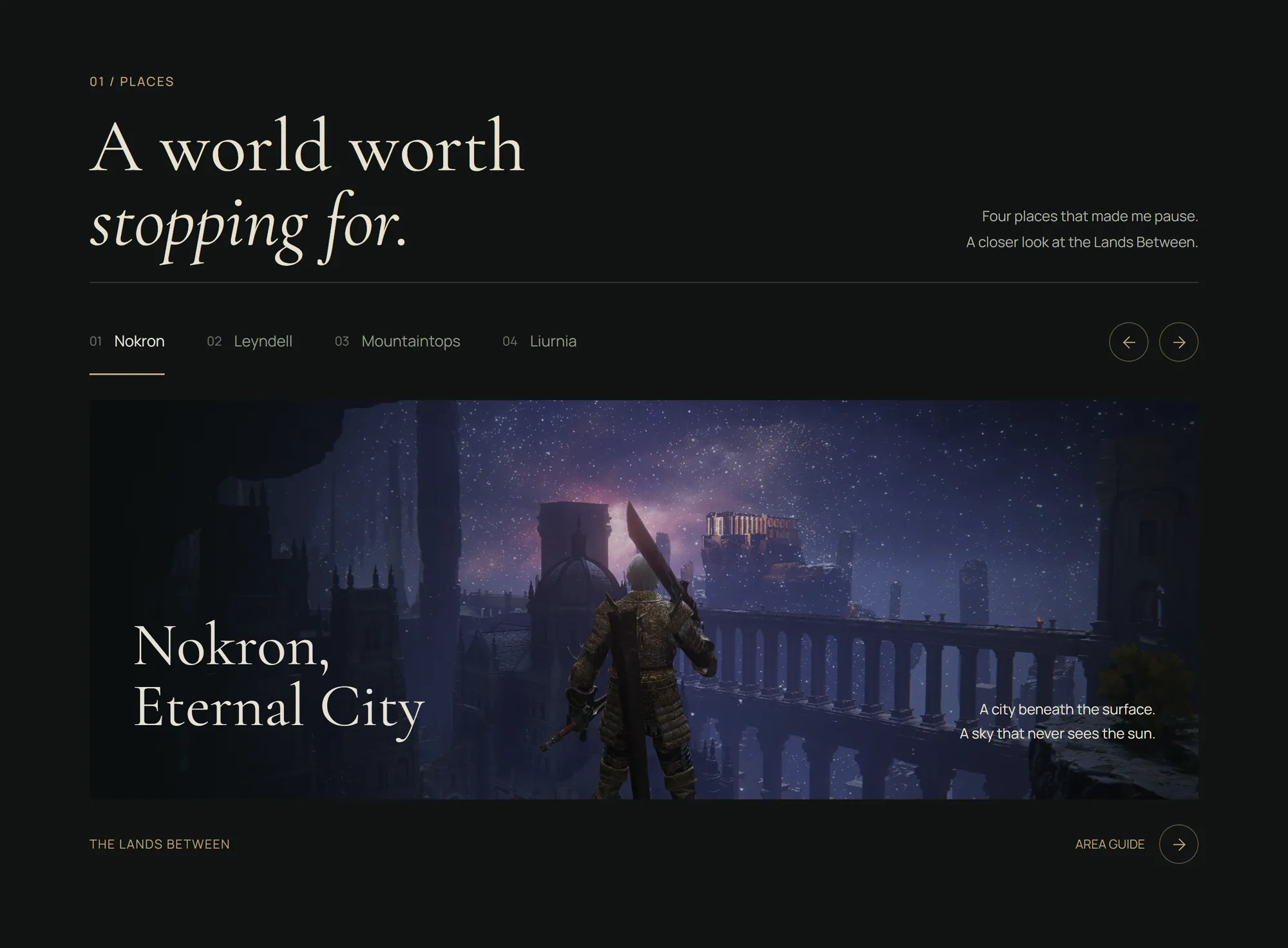
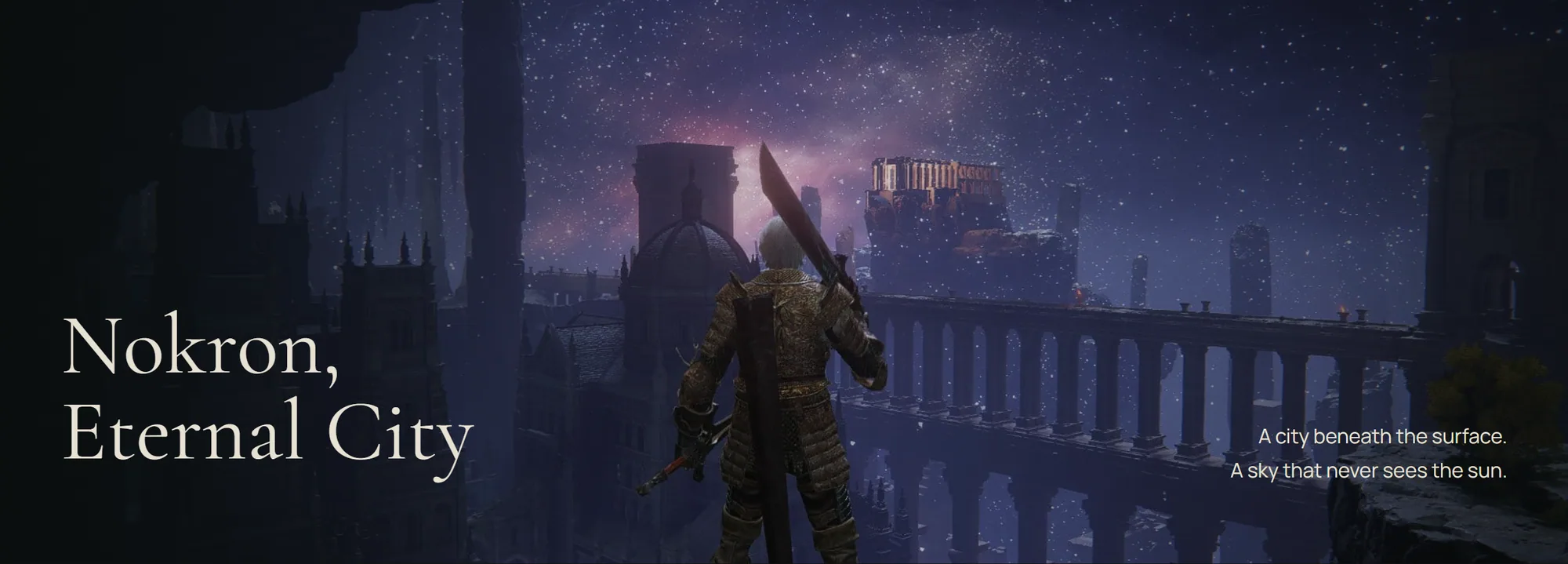
Places: one frame, four stops.

Choosing a place changes the photograph and caption without changing the height of the section. It advances on its own, and pauses off-screen, on hover or focus, and when the viewer is open. Try the tabs below; these are captures from the live page.

Places panel showing Nokron, Eternal City.

Hall of Legends: boss cards open their footage in the shared viewer.

The Little Things: six items I relied on. Each links to a reference.

Journal: 78 photographs, two ways to browse.

Places, Bosses, and Grace & wonder split the archive into collections, shown as a grid or as masonry. The viewer keeps each photo at its original ratio and adds zoom and keyboard navigation.

Collections

Masonry view

Viewer

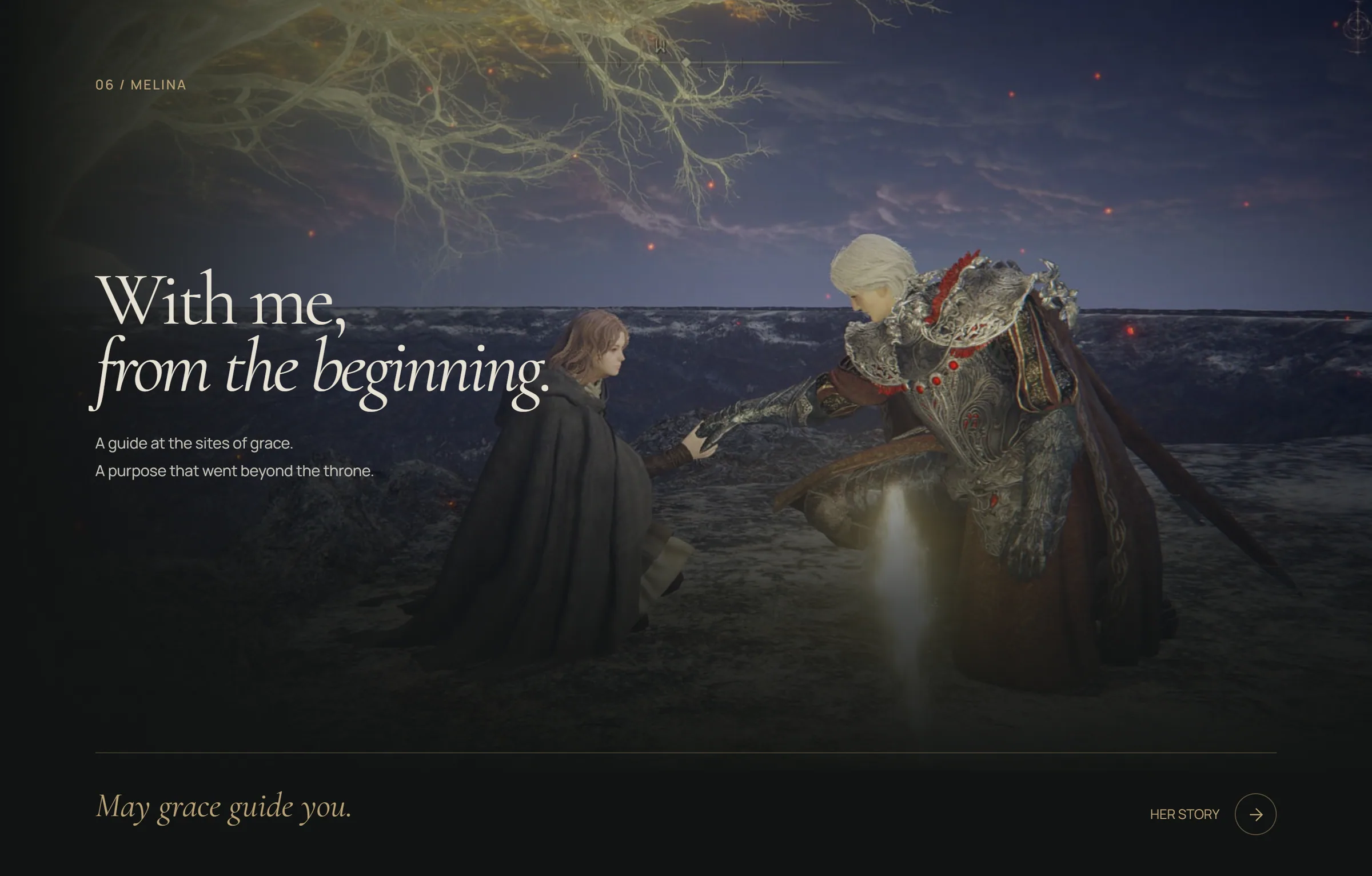
The Melina chapter: the Tarnished and Melina at a site of grace under the title With me, from the beginning.
Melina gets her own chapter, the guide who was there from the beginning. It sits directly before the ending, so the page pauses on her before it turns blue.

Age of the Stars

The page turns night blue for the ending, and so does this one.

  1. 01 · Where Her Path Led Me.

  2. 02 · A Promise in Her Hand.

  3. 03 · Where I Belonged.

  4. 04 · A Thousand Years Under the Moon.

  5. 05 · The Unfathomed World Ahead.

  6. 06 · An Age of Our Own.

The same story on a phone.

Compositions reorder for small screens. Controls stay large and don’t depend on hover.

09 / Build and QA

Testing the design by building it.

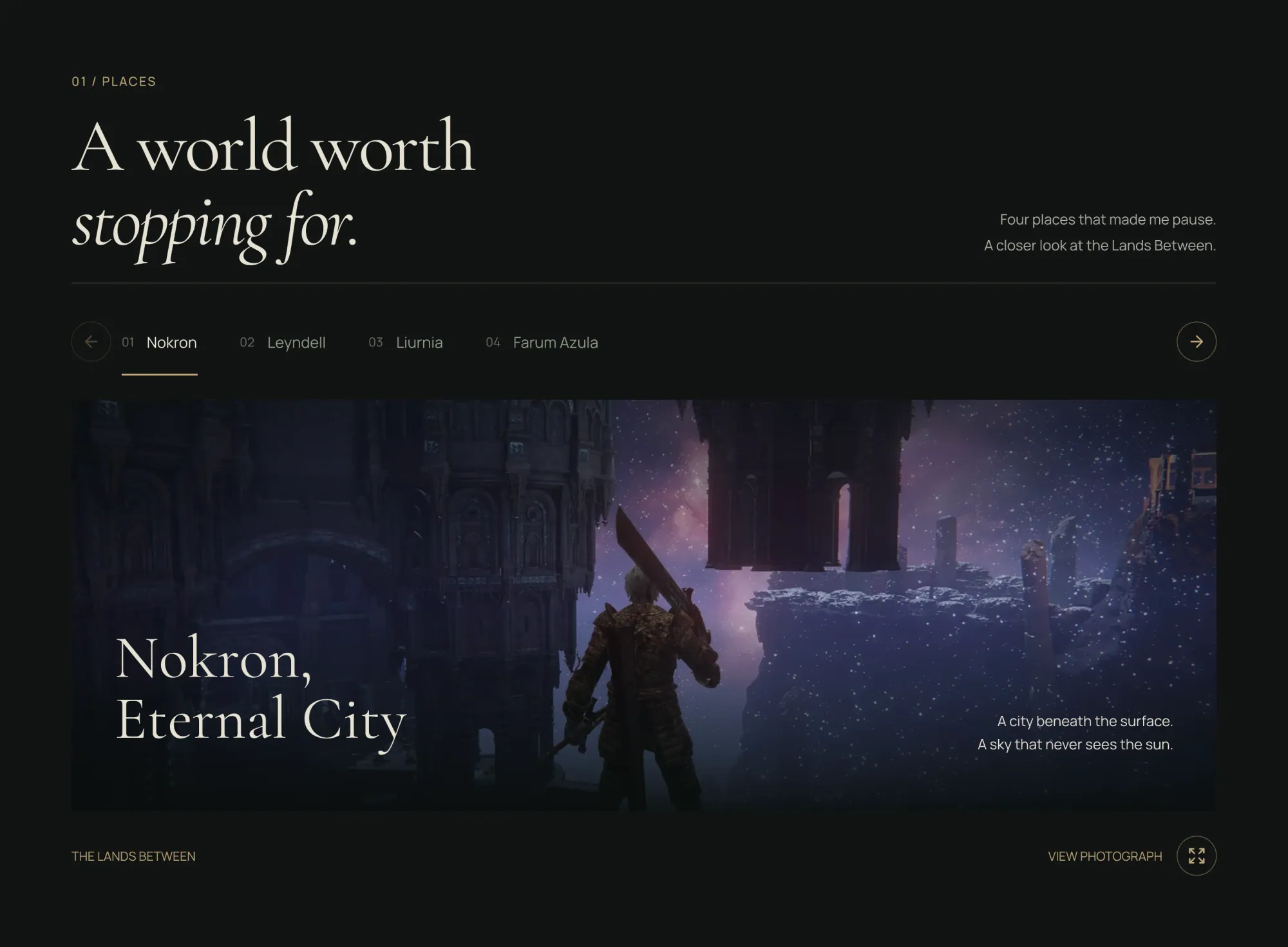
A static board can’t show how scrolling feels, how a font renders, or how an image loads. So I compared the browser with the Pen.dev frames section by section, then adjusted spacing, crops, alignment and small-screen layouts.

The Places section on the live site.
The Places section as designed in Pen.dev.
Pen.dev designLive site

Drag to compare the Places section in the design file and on the live site.

What changed after the boards.

Hero
The Tarnished in an open landscape.
The doorway frame, changed during the build.
Bosses
Static cards.
Silent looping footage on the two favourites, with the photograph as poster and fallback.
Ending
A moon stage with a title on top.
A scroll-driven voyage through six memories.
Journal
Filters with a sort control.
Four collections and a grid or masonry layout switch.

Motion stayed editorial.

I compared three approaches. No WebGL, custom cursors, forced scrolling or artificial loading delays. With reduced motion, parallax, positional reveals and ambient movement all switch off.

  • Atmospheric

    An effects-heavy approach built on ambient layers.

    Considered, not chosen.

  • Pinned and 3D

    A spectacle built on pinned scenes and 3D.

    Considered, not chosen.

  • Editorial

    Short reveals and parallax, with three signature moments: Hero, Places, and Melina into the Ending.

    Chosen as the better fit for photography, performance and maintainability.

The motion audit.

A 26 October audit covered the motion across 54 source files. Four bugs were reproduced in the browser, and all four are fixed in the shipped code.

  1. 01The hero caption vanished after a button lost focus, because the entrance animation restarted.
  2. 02Turning motion back on replayed a hero that had already finished.
  3. 03Reveal cleanup wiped the pointer position, so card hover lighting jumped back to its default.
  4. 04A photo that failed to load left the viewer on “Loading photograph…” forever. It now offers Retry.

Video that loads when it’s needed.

Malenia’s source video is 16 MB. Her card uses a 6.9 MB, 720p, silent rendition that starts loading 180px before the card enters the screen and pauses when it leaves. The photograph stays underneath as poster and fallback.

Lighthouse on the live site

MetricDesktopMobile
Performance9984
Accessibility100100
Best Practices100100
SEO100100
Largest Contentful Paint0.8 s3.9 s
Cumulative Layout Shift00

Median of three runs per device, 6 November 2026. This is lab data, not real visitors.

How I worked with AI

I set the direction, chose the content and screenshots, and reviewed the design decisions and the build. The frontend was built with help from Codex. ImageGen produced some item illustrations, which I redirected until their shape and colour fit the site. Sources are listed on the Credits page. The gameplay photographs are all my own.

10 / Work log

Logged as it happened.

During the project I posted progress updates, with the time each session took. These are sessions 4 to 8, as I posted them, with the notes lightly edited.

#4

9 Oct · 2h 45m

Explored movie and gaming website layouts, aligned with the design system and my creative direction.

Curated and refined design references to set a focused visual direction.

1 of 5

11 / Testing

Tested with 6+ people.

I met each person directly and covered usability testing, a design critique and a design review in the same session. The feedback led to design improvements and new features.

In each session

  • Usability testing
  • Design critique
  • Design review

Who took part

  • Frontend developer
  • Backend developer
  • Analyst
  • UI/UX designer
  • Gamer

12 / Reflection

Adding sections did not make the project stronger.

Pick the story first.

Once I chose a story I could tell myself, the design direction became clearer and the scope could shrink.

The rules came before the options.

The section test, nine review criteria and the “invent nothing” rule were written down before the directions, so every direction was compared on the same terms.

A board can’t judge scroll.

A static design can’t prove how scrolling, font rendering or image loading will feel. The hero, the boss footage and the ending all changed once they ran in a browser.

What this page can’t claim.

The feedback comes from a small group and is qualitative. It shows what these 6+ people saw, not how a wider audience would respond.

  • No usage metrics, so nothing here claims a change in behaviour.
  • My recorded QA ran at several widths in desktop Chrome, not on physical phones or in Safari.
  • Mobile LCP is 3.9 s, the weakest number on this page.
  • The design file still documents colours as fills, with no shared variables or formal breakpoints.

Contact

Have any project in mind?
Let’s work together